A professional, outspoken rebrand for search and consultancy agency Neo-Mundo
Client -> Neo-Mundo Services -> Branding, Digital Design, Illustration Team -> Wordpress development by Ramon Geertjes

About the project
Neo-Mundo is a search and consultancy agency for the health sector. In 2021 they celebrated their 10th anniversary with a rebrand of their visual identity.

Brand positioning
To reflect on their first ten years and shape a vision for the future the Neo-Mundo team worked with an expert on their brand positioning. To test if their current visual identity still matched their new goals and ideas I did a brand analysis and hosted a workshop with the complete team. This helped me understand what elements of their visual identity should stay, and which were ready for an update.

The new logo
With the outcome of the workshop in mind I started with a redesign of the logo. I kept the loved characteristics of the original logo: the warm colours, the round shape and the fact that it stands out from what competitors are doing.
Neo-Mundo translates to ‘new world’, and building a new world in health-care is a big part of the company's vision. The team is what truly makes Neo-Mundo stand out as a company, and based on that I build a new logo icon. It’s a collection of unique, diverse shapes — representing the uniqueness and diversity of the team — that come together as a whole to create a perfect circle, a new world. The elements that build the shape can be used on their own as a fun, visual language in on- and offline communication.


Kind words
“The collaboration with Jantine is very pleasant! She always delivers something beautiful that fits our brand perfectly. She works in a structured way and knows how to translate and process feedback well. Expectations are well managed in advance, so you always know where you stand. Jantine is a creative professional that we will certainly work with more often in the future!
Janine Vinders
Marketing & Communications Officer at Neo-Mundo

Social media
Neo-Mundo has an active social media presence and creating a set of on-brand templates for their socials was a big part of the rebrand. I designed several templates they can easily use and edit themselves in Canva. This way it’s easy to create new posts when needed, and make sure they keep a consistent visual branding in their feed.

A creative collaboration
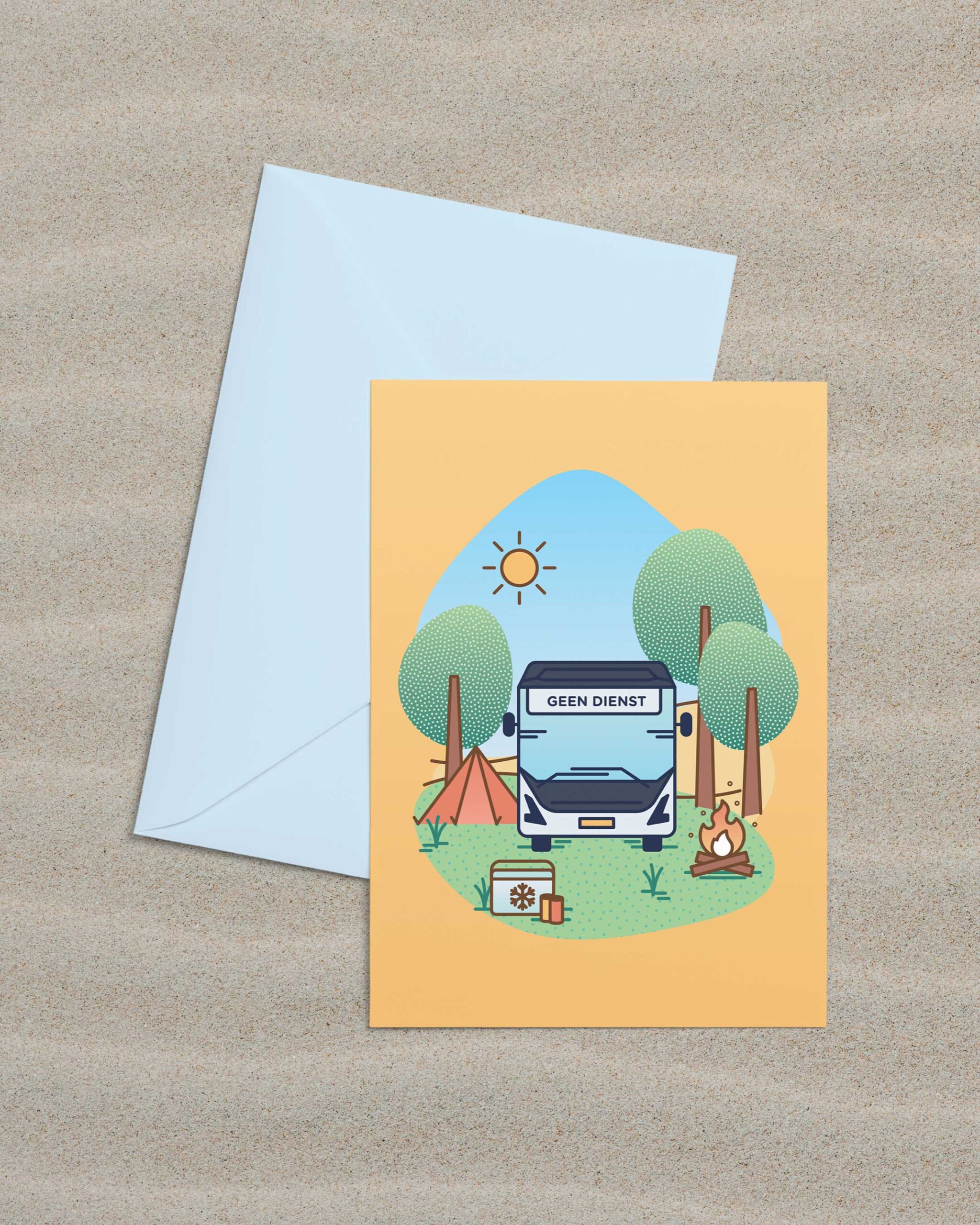
After the rebrand, I continue to support Neo-Mundo with custom design projects—from CV templates to Christmas cards and seasonal greetings for their clients. Each piece is thoughtfully designed to reflect their visual identity, ensuring their communications feel polished, cohesive, and true to the brand.


Kind words
“Jantine supported us from scratch, step by step. We started the project with a workshop with our stakeholders to define the new website’s structure, resulting in a content plan. The workshop helped our way of thinking about the structure and communication goals of the website.
The refreshed brand identity is a striking update, thanks to Jantine’s empathy with our company. She also helped us in planning the roll-out from webdesign to development, which was a well structured and clear process.
All-in-all, Jantine is a good professional, she has a unique combination of creativity, structure and leadership to manage a project in an effortless co-production.”
Mijke Eggink
Founder at Neo-Mundo

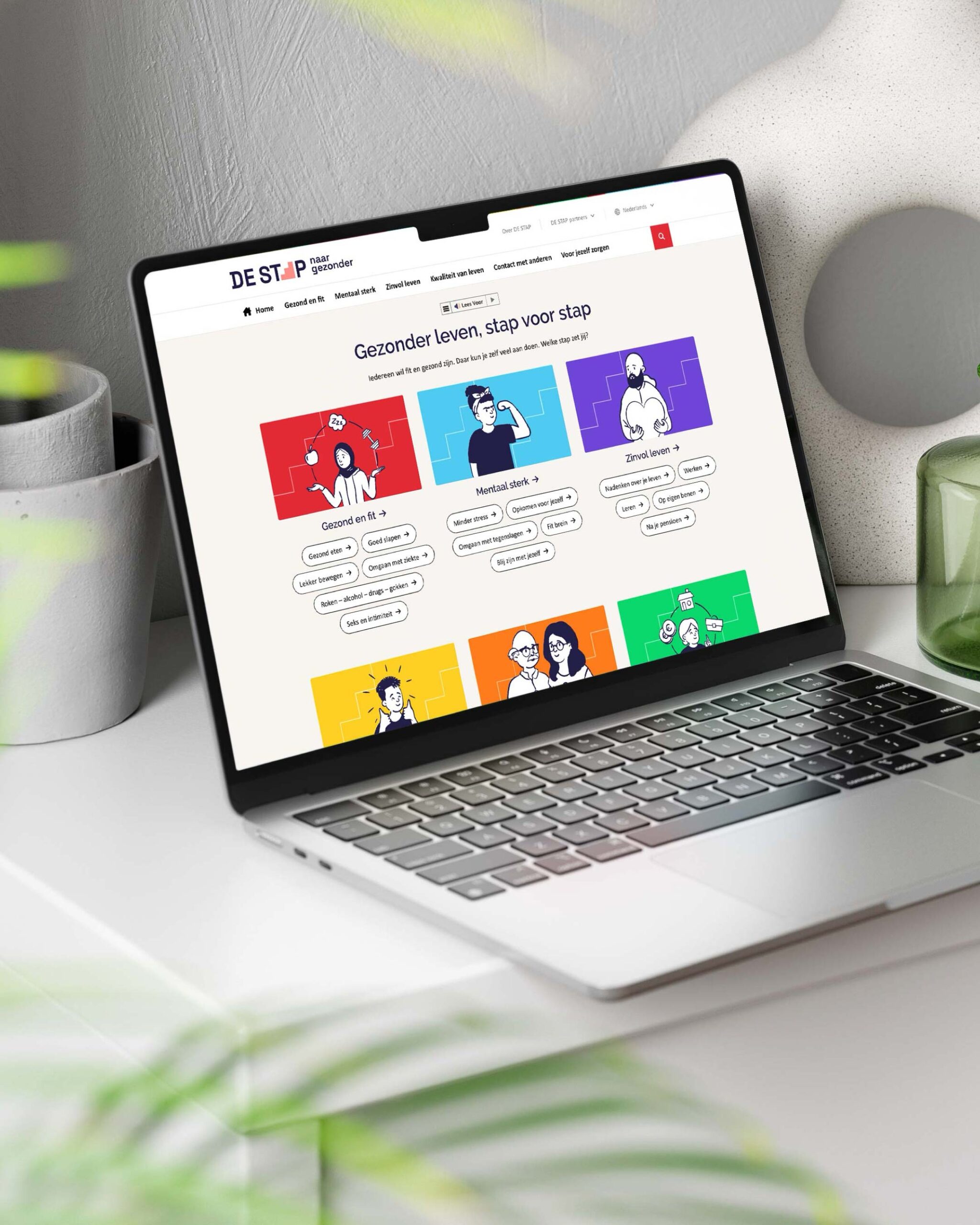
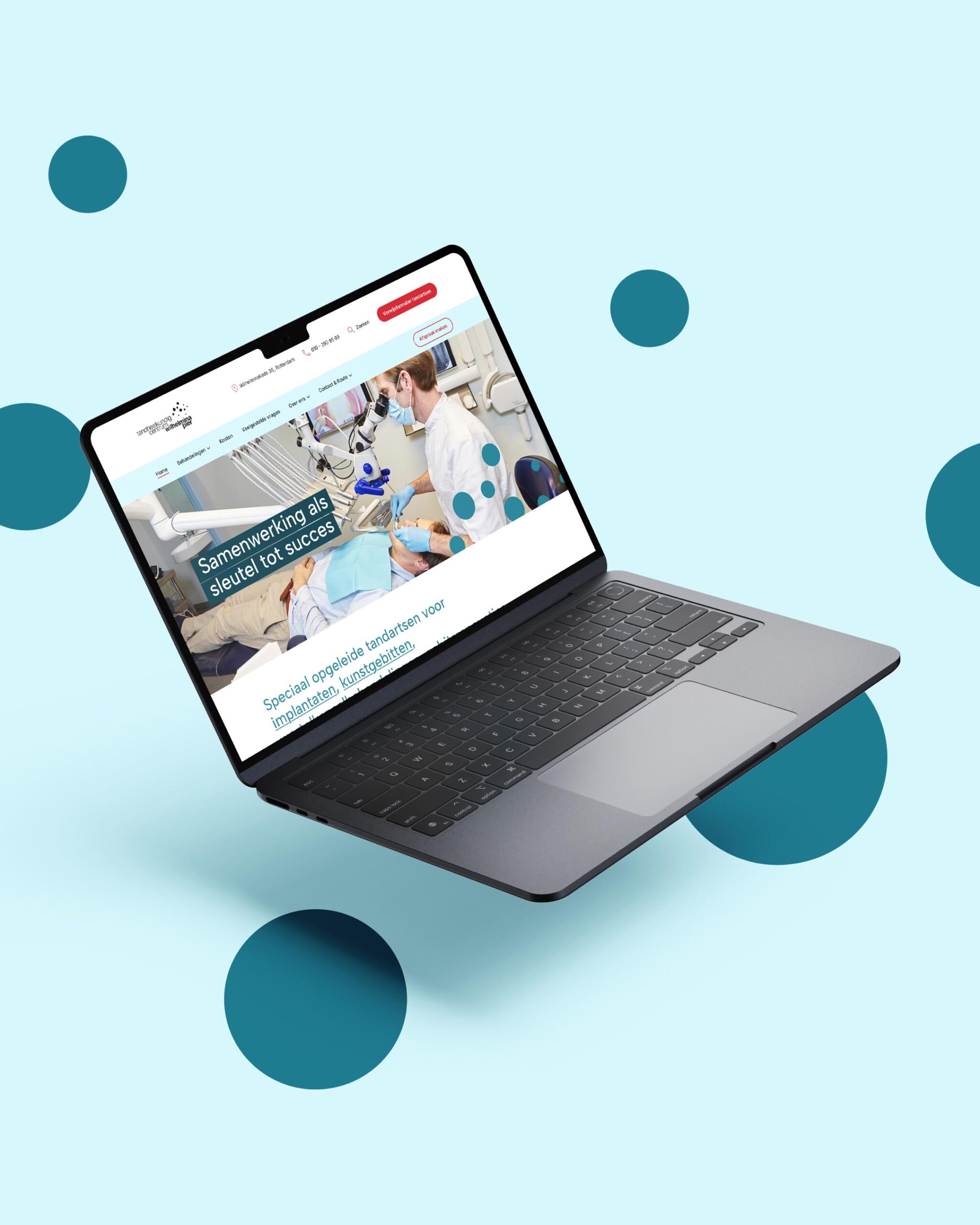
Website
My collaboration with Neo-Mundo started in 2018 when we completely restructured and redesigned their website. To match the fresh brand identity I redesigned some visual elements to give the website a consistent and up-to-date look.

More work


Let’s get in touch!
Haelsum is a Rotterdam-based design studio offering branding, web design, digital design, and illustration for creative and mission-driven brands. Working with clients in the Netherlands and worldwide.
© 2025 Haelsum — Thoughtful design made with care, coffee, and a little bit of creative magic.
LinkedIn — Instagram — Terms & Conditions: Dutch — English — Cookie Policy